Rough Sketch
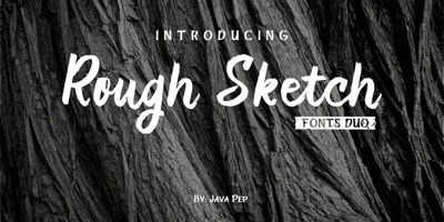
Rough Sketch Font Family was designed by Java Pep and published by Java Pep. Rough Sketch contains 2 styles and family package options. Introducing Rough Sketch fonts duo. This font has character ...
Rough Sketch Font Family was designed by Java Pep and published by Java Pep. Rough Sketch contains 2 styles and family package options. Introducing Rough Sketch fonts duo. This font has character ...
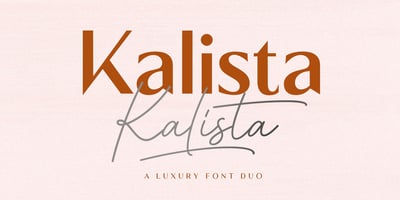
Kalista Font Family was designed by Mulkan Nazir and published by Great Studio. Kalista contains 5 styles and family package options. Kalista Font Duo is a luxury font. which comes with a combination ...
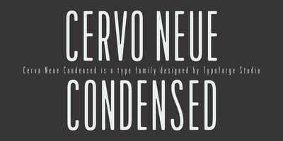
Cervo Neue Condensed Font Family was designed by Błażej Ostoja Lniski and published by Typoforge Studio. Cervo Neue Condensed contains 18 styles and family package options. Cervo Neue Condensed is ...
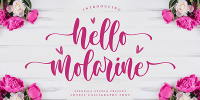
Hello Molarine Font Family was designed by Zeenesia Studio and published by Zeenesia Studio. Hello Molarine contains 1 styles and family package options. Hello Molarine is a calligraphic script font ...

Lina Serif Font Family was designed by Caroline Herr and published by Caroline Herr. Lina Serif contains 5 styles and family package options. Lina Serif is an antiqua balanced between classic and ...
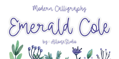
Emerald Cole Font Family was designed by Fachrizal Yusuf and published by Allouse Studio. Emerald Cole contains 1 styles and family package options. Proudly Presenting, Emerald Cole a Modern ...
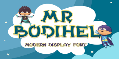
Bodihel Font Family was designed by Saiful Anwar and published by Sealoung. Bodihel contains 1 styles and family package options. Bodihel is a cute and chunky charactered display font. Add this ...
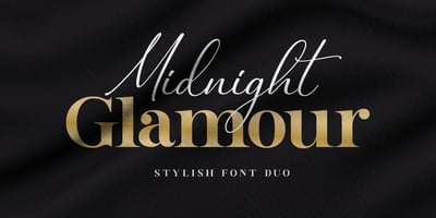
Midnight Glamour Font Family was designed by Diki Hermawan and published by Typestory. Midnight Glamour contains 2 styles and family package options. Midnight Glamour is an incredibly elegant and ...

Menthol Signature Font Family was designed by Donis Miftahudin and published by Din Studio. Menthol Signature contains 1 styles and family package options. Menthol signature is a classy monoline ...
The Fox Tail Font Family was designed by Donis Miftahudin and published by Din Studio. The Fox Tail contains 4 styles and family package options. Hi Font Lovers! Let me introduce you to The Fox Tail ...