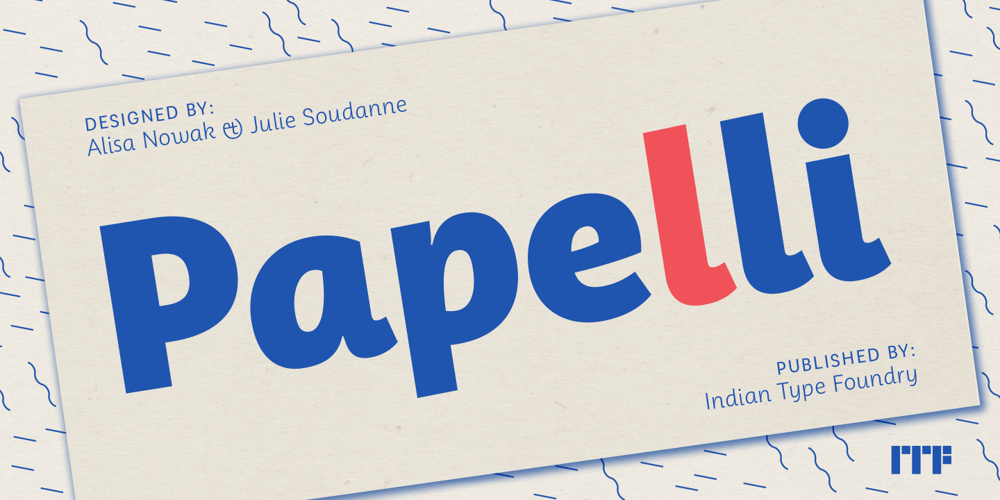
Papelli Font Family was designed by Alisa Nowak and published by Indian Type Foundry. Papelli contains 6 styles and family package options. Papelli is an informal sans with a feminine touch. It is created for use in advertising and corporate or editorial design. The typeface feels like an upright italic; the lowercase letters are especially inspired by cursive writing. Papelli’s ‘a’ is single-storey, and the ‘v’ and ‘w’ have in-strokes on their left-hand sides. The lowercase ‘g’ has a Danish-style truncated-bowl for a descender (a more conventional, single-storey ‘g’ is available in a stylistic set). Many uppercase letters have playful features; for instance, the bottom diagonals on ‘K’ and ‘R’ have cursive out-strokes, and the tail on the ‘Q’ is very energetic. Papelli’s other diagonals are curved, rather than straight – check out the ‘A’, ‘V’, ‘W’, and ‘Y’.


