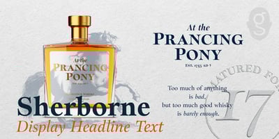
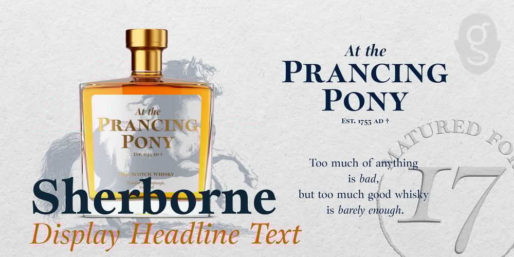
Sherborne Font Family was designed by Nick Cooke and published by G-Type. Sherborne contains 30 styles and family package options. Inspired by a comment in a letter from Eric Gill to Stanley Morrison, Sherborne has “waisted” vertical stems, meaning they curve inwards to give an elegant appearance resulting in a typeface of supreme legibility and beauty.Sherborne references its calligraphic roots featuring tapered stems, angled axes and bracketed serifs so could be considered a Humanist Old Style…with a distinctly modern twist.Display styles have shorter serifs and a greater thick/thin contrast, exuding more delicacy and elegance compared to their more robust Text counterparts. X-heights grow progressively larger from Display, through Headline to Text.Each family set contains 5 weights from Thin to Bold plus italics, a total of 30 fonts.