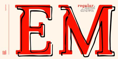
WBP Emperio Font Family was designed by Jasper Nijssen and published by Studio Jasper Nijssen. WBP Emperio contains 2 styles and family package options. A classic serif font with a twist. WBP Emperio has an interesting shape. She has rounded corners and a slightly ‘curvy’ look. The little indent makes her stand out above the rest. A sensation in the making. Emperio has two styles. The Regular: Great for designing friendly corporate identities. And there’s the Hand Drawn style: Great for design posters of prints with a handmade feel. Combine the two and you can go infinite. WBP Emperio was a sketch I designed when I started my company. So you can say it’s been five years in the making XD. When I was invited to add two pages to the Typodarium 2022, I speeded up the process and added the hand-drawn style. The end result is awesome. A classic serif font, with a crazy extra style.